Schriftklassifikation — Typography Posters
Twelve A4 posters that turn type classification into something you can hang on a wall—history, structure, and when to pick serif vs. sans.
Client: Academic Project
Published: Jan 15, 2024
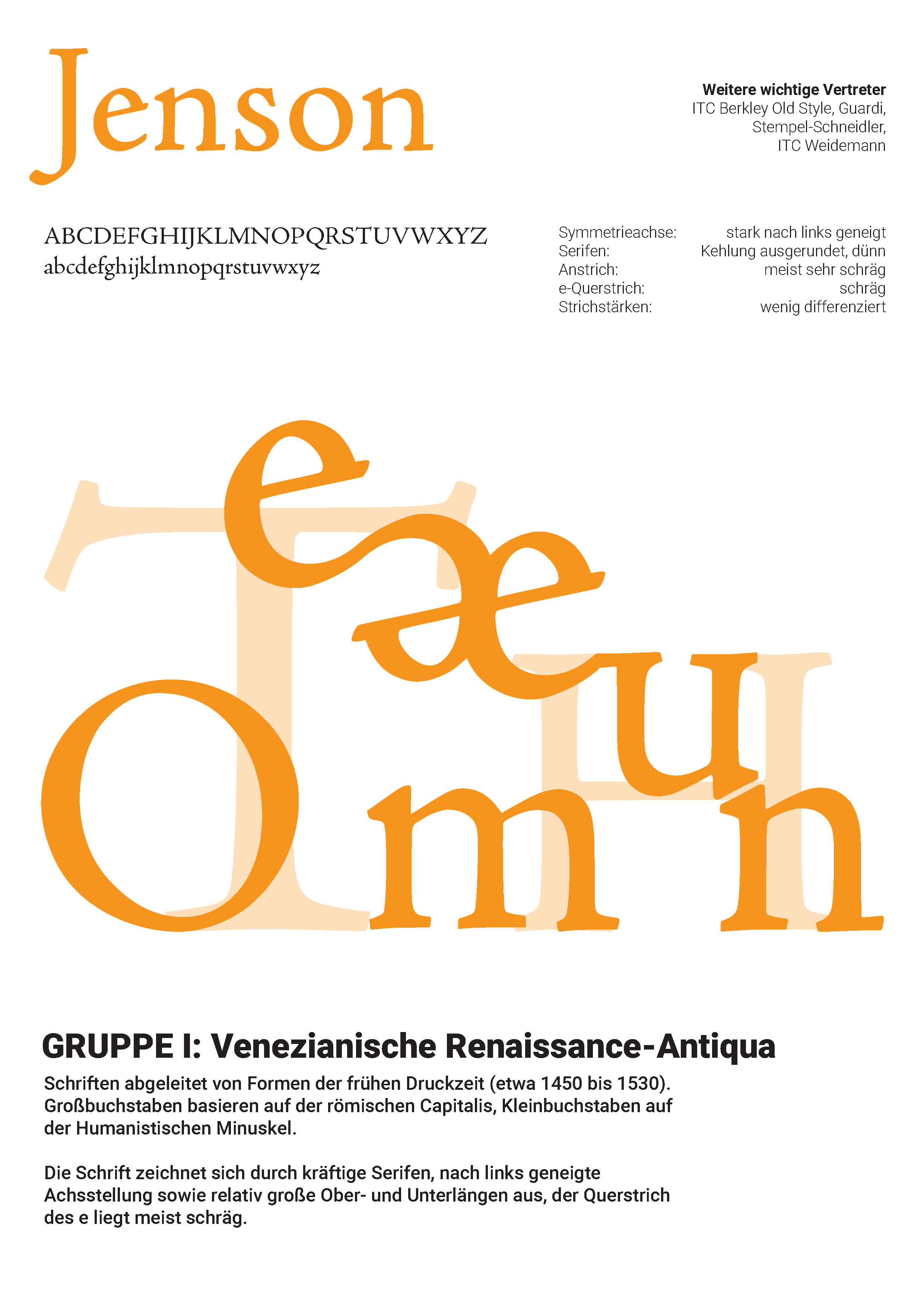
If you can’t see the serif, you haven’t taught the classification.
This series is type history for a wall, not a slide deck. Each A4 sheet isolates one idea—often a landmark face like Jenson—and makes the structural traits legible before you read a word of the German caption.
How the posters work
Specimen alphabets sit next to notes on axis, serifs, and historical context. Large overlapping characters do the teaching: you notice the slanted e bar or thin bracketed serifs because they’re huge, not because a paragraph told you to look.
Why it matters
Classification only sticks when you can apply it. The last poster compares serif and sans for print vs. screen, long text vs. headlines—closing the loop from museum history to everyday layout decisions.