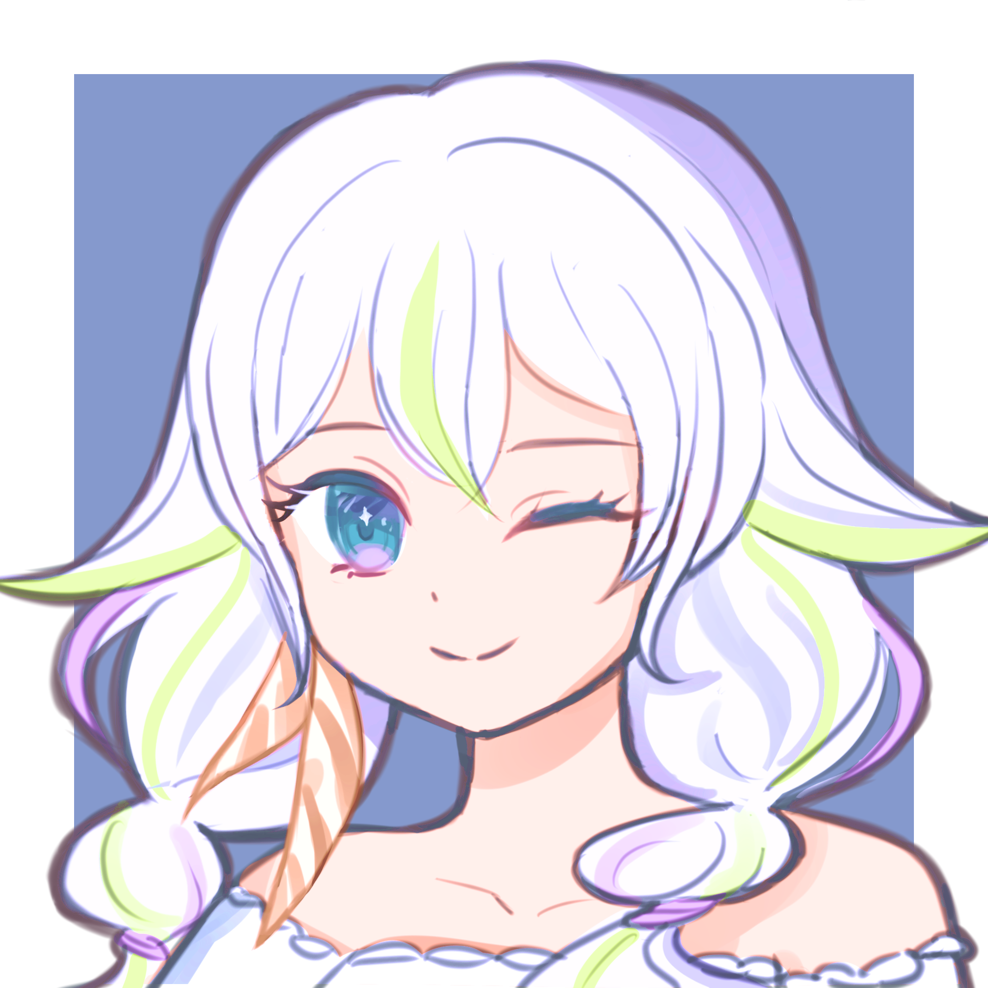
Hi, Trung here 👋
26 year old graphic designer from Vienna 🇦🇹
Graphic designer by trade, driven web developer and editor. I love bringing stories to life through innovative visual content.
Last played
No recent activity.

Experience & Education
Selected roles and collaborations that shaped my craft—impactful work across brands, campaigns, and products.
- Designed and built an EU-funded NPO website in Framer with clear IA, responsive layouts and smooth UX.
- Created logo and motion assets for BFI Wien's career orientation course across print, digital and animation.
- Boosted CHI CHI Snackbar in-store traffic by ~20% through targeted, on-brand social content.
- Directed EU-funded visual identity and brand strategy, ensuring 100% compliance and a 15% engagement rate.
- Produced 20+ print and digital assets for recruitment and EU reporting, streamlining stakeholder communications.
- Facilitated 6 workshops and annual photography, contributing to a 90% participant satisfaction rating.
- Collaborated with Creative Director to execute agency-wide rebranding and develop core visual brand assets.
- Designed social visuals and short videos for startups, boosting audience engagement by 40–60%.
- Produced high-impact print materials for early-stage client launches and integrated marketing campaigns.
- Led end-to-end content production, overseeing strategy, post-production, and cross-platform publishing.
- Optimized YouTube pacing and storytelling, enhancing retention across long and short-form video.
- Drove ~36% lead growth by refining content strategy based on data-driven performance analytics.
Why Haetbiit?
Haetbiit, which means "sunlight" in Korean, was founded with the vision of creating a space where creativity meets technology. Our journey began with a simple idea: to help individuals and organizations tell their stories through innovative visual content. Over the years, we have evolved into a diverse team of passionate creators, each bringing their unique skills and perspectives to the table.
Our logo is a symbol of this vision. It represents the creative eye we use to illuminate your story. The central shape is a powerful symbol of our vision, representing our Inspiration and Innovation, the two core pillars of our work. This is reflected in the double "i" of our name, a direct nod to the Korean character for "light" (빛). The continuous line that forms the symbol reflects our commitment to a seamless and collaborative process from start to finish. It’s a design meant to be seen and interpreted, just like the stories we help create.


