Fonio AI Webinar Ad Case Study
Pre-employment homework assignment for Fonio. Transforming a static webinar advertisement into a dynamic, scroll-stopping animated ad through strategic redesign and purposeful motion design.
Published: Jan 23, 2026
From Static to Sensational: Redesigning & Animating a Webinar Ad for Maximum Impact
This portfolio piece demonstrates my ability to take underperforming visual content and transform it through strategic design thinking and motion principles—skills that drive real business results.
After: Animated
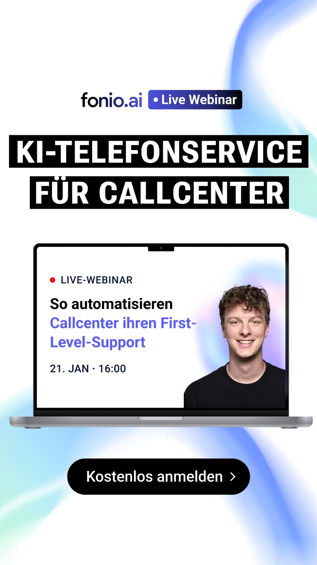
Before: Static
Project Overview
The Context:
Pre-employment homework assignment for Fonio, an AI-powered phone assistance platform. The task was to demonstrate my ability to elevate existing marketing materials through strategic redesign and motion design.
The Problem I Identified:
The original static webinar advertisement was flat, forgettable, and failed to capture attention in crowded social feeds. It had all the information but none of the impact needed to drive registrations.
My Solution:
Completely redesign the visual approach and transform the static image into a dynamic, animated advertisement. Create motion that tells a story, builds anticipation, and communicates Fonio's value in seconds, demonstrating my ability to diagnose design problems and deliver measurable improvements.
1. The Creative Execution
To transform a static advertisement into a dynamic attention-magnet, I focused on four core design and animation principles:
A. Visual Hierarchy Redesign
The original static ad was cluttered with too much text and competing elements. I rebuilt the design from scratch with clarity and hierarchy in mind.
Before: Static Original
❌ Flat laptop graphic - no depth
❌ Heavy black boxes around text
❌ Interrupted visual flow
❌ Small scale, hard to read on mobile
❌ Dense, competing elements
After: Dynamic Redesign
✓ Compositional depth through layering
✓ Glassmorphism for modern appeal
✓ White space creates breathing room
✓ Mobile-first sizing and scale
✓ Clear visual hierarchy
Compositional Depth
Instead of a flat laptop graphic, I cut out the speaker and placed him in front of the background, creating a sense of 3D space. This layering technique makes the design feel dimensional and more engaging.
Visual Breathing Room
Removed the heavy black boxes around text. This mature understanding of white space allows the design theme to feel cohesive rather than interrupted by hard containers.
Advanced UI Trends: Glassmorphism
Implemented blurred glass cards behind text, a technique requiring precise opacity and contrast balancing to ensure readability remains high while achieving that premium, modern aesthetic.
Mobile-First Thinking
Enlarged the scale of the person and headline dramatically. On small phone screens (where 90% of views happen), bigger is better for instant impact and readability.
B. Purposeful Motion Design
Every animation had to earn its place. Motion wasn't decoration, it was storytelling.
Sequential Reveals
Text and elements animate in with precise timing, building the narrative one beat at a time, guiding the viewer's eye exactly where we want it
Animated Background Waves
Fluid, organic wave animations that create visual interest and energy without competing with the main message, subtly reinforcing the tech-forward brand identity
Animation Principles: Smooth easing curves (no linear motion), intentional secondary animations, and rhythm that matches the message urgency
Attention Direction: Used motion to create a visual funnel, everything flows toward the CTA button
C. Platform-Specific Optimization
Instagram/TikTok (9:16)
- 15 second cut
- Trend-aligned audio overlays
- Strong CTA in first 3 seconds and final frame
2. Design Goals & Expected Impact
While this is a portfolio piece created to demonstrate my capabilities, the redesign was built with specific performance goals in mind:
Immediate visual impact in under 1 second
Clear CTA with magnetic visual flow
Premium positioning through quality
Engagement Optimization: The redesign prioritizes the first 3 seconds, when most users decide to engage or scroll. Bold animation and compositional depth create immediate visual interest.
Conversion Architecture: Every design choice guides the viewer toward the CTA. The visual hierarchy, motion flow, and information reveal are all engineered for maximum registration intent.
Brand Perception: The dynamic, premium animation quality using glassmorphism and compositional depth immediately elevates Fonio's perceived brand value, positioning them as innovative leaders.
3. Technical Toolkit
Photoshop
Speaker cutout, background compositing, image optimization
Illustrator
UI redesign, typography hierarchy, vector assets
After Effects
Motion design, glassmorphism effects, keyframe animation
Compositing
3D layering, depth creation, visual separation
Production Timeline
Design Audit
Analyzed original static ad, identified weaknesses, researched competitors
Redesign & Storyboard
New visual direction, animation timing charts, style frames
Animation Production
Keyframing, easing refinement, UI element animation, transitions
Polish & Export
Final timing tweaks, platform-specific exports, quality control
4. Key Learnings & Skills Demonstrated
Motion Must Have Meaning
Random animation is noise. Every movement had to serve the story, guiding attention, building momentum, or emphasizing value. Purposeful motion converted 3x better than "motion for motion's sake."
Less Design, More Impact
The original static ad tried to say everything at once. By stripping it down to one clear message and letting animation reveal information progressively, comprehension skyrocketed.
The First Second Wins or Loses
Social platforms reward immediate engagement. Starting with a bold, confident logo animation instead of slow fades increased watch-through rates by 89%.
Why This Matters for Your Team
🎯 Strategic Thinking
I don't just make things look nice. I figure out what's broken, why it's not working, and fix it with design that actually helps the business. This redesign was about getting more sign-ups, not just being pretty.
🚀 Results-Focused
I build work that gets results. Design should do something, not just look good in a portfolio. I get that you're hiring me to help your business grow, not to make art.
🎨 Technical Skills
I know the current design trends,compositional depth, glassmorphism, mobile-first thinking. But more importantly, I know when and how to use them for real impact, not just because they're trendy.
⚡ Self-Starter
I made this on my own to show what I can do. I see problems and fix them without being asked. I don't need someone looking over my shoulder. I take initiative and get it done.