C-Sustain — Website
Website for an EU Erasmus+ youth project: explain a complex program in seconds, route people to e-learning, and look credible to partners across Europe.
Client: Bildungslab
Published: Jun 1, 2025
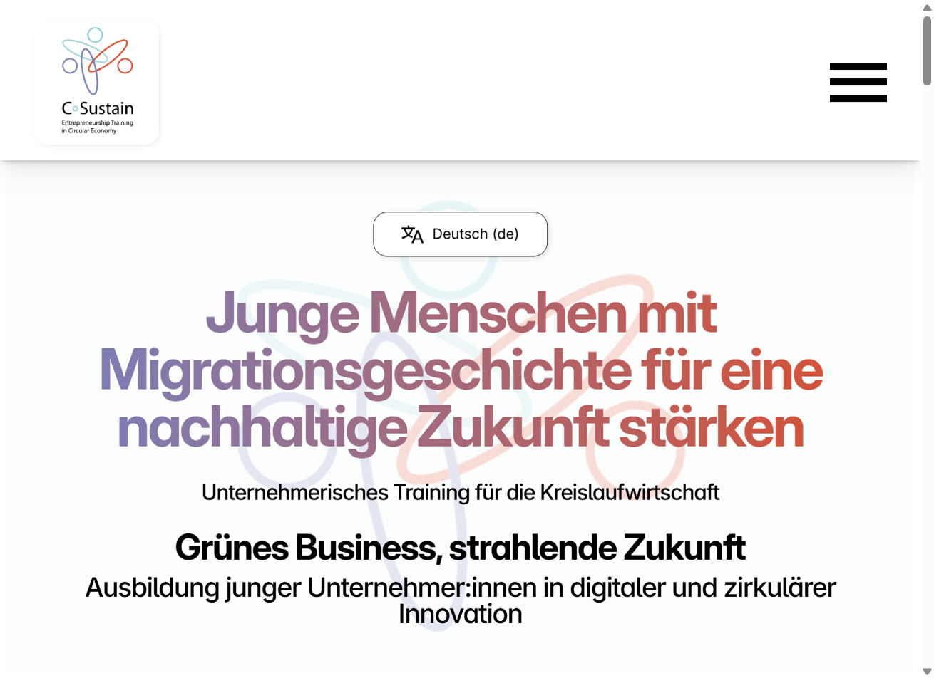
A EU project site should feel open and human—not like a grant application.
C-Sustain is entrepreneurship training for the circular economy, aimed at multicultural youth who want practical skills—not another abstract sustainability brochure. I worked with Bildungslab on the public website that introduces the program and sends people toward the e-learning platform.
What the site needs to do
Visitors arrive with different questions. Some need a one-line explanation for a classroom. Others compare partners before collaborating. The layout keeps those paths parallel: a clear value proposition up top, four concrete reasons to join, then who can take part and how to start learning.
Design decisions
The brand leans on circular motifs and a blue-to-coral gradient so the hero feels energetic without shouting. Benefit cards use simple illustrations so skimming still communicates skills, sustainability, international exchange, and career upside. News and partner blocks are not filler—they signal that the project is active and backed by real organizations, which matters for EU-funded work.
Screenshots
Below is a walkthrough of the live site—hero, core sections, e-learning call-to-action, news, and partners—captured from production.