

Development Process
The project began with in-depth research into the skincare market, target demographics, and sustainable beauty trends. From there, I developed a modern brand identity that reflected Alneo’s core values: natural ingredients, deep hydration, and skin rejuvenation. The visual direction emphasized softness, purity, and minimalism key qualities associated with clean beauty.
The brand identity system included a custom logotype, a fresh, nature-inspired color palette, and a refined typographic hierarchy. I extended the identity across eco-conscious packaging concepts, applying design choices that highlighted both sustainability and shelf appeal.
Project Showcase
Visual documentation of key features, user interfaces, and implementation details
Project Videos
Watch the project in action and see key features demonstrated
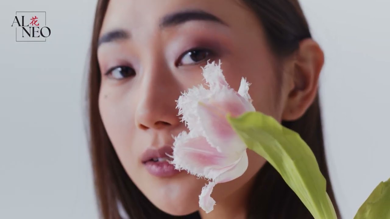
Alneo Skincare Moisturizer - Advertisment
Challenges & Solutions
A primary challenge was balancing the brand’s modern aesthetic with the authenticity of natural skincare. To solve this, I paired organic visual elements such as subtle textures and botanical cues with clean, contemporary layouts.
Another challenge involved designing packaging that felt premium while using sustainable materials. I addressed this by selecting recyclable substrates and proposing minimalist designs that reduced ink use and waste, without compromising visual impact.
Results & Outcomes
The final brand identity positioned Alneo as a credible and stylish player in the clean beauty space. The cohesive visual system communicates hydration, purity, and care building trust with eco-conscious consumers. The packaging designs not only reflect the brand’s sustainability ethos but also stand out in a competitive skincare market.
The project was well-received for its clarity, visual harmony, and relevance to today’s values in skincare and sustainability.

Hydra Boost Collection
Complete 4-step routine
Anti-Aging Serum
clinically proven results
Project Impact & Results
Ready to Build Something Amazing?
Let's discuss how I can bring the same level of expertise and dedication to your next project.